Stax onboarding redesign
About Stax
Stax is a startup based in Melbourne that’s building a cloud management platform that helps teams and organisations to create a cost efficient, secure and healthy Amazon Web Services cloud. One of the projects I took on at Stax was redesigning a crucial piece of the onboarding process that would allowed customers to experience the full value of the product during the free trial.
My Role in the team
Stax was a small startup at that time and the team consisted of 12 people. On this project I worked closely with the technical UX Designer, the PM and the GM to define the problem, gather insights and validate ideas. As product designer with a focus in UI, my responsibilities on this project were sketching, prototyping and testing solutions, as well as preparing final designs and specs for the developers and doing QA testing before releasing into prod. Additionally, I made the illustrations series that guided users through the new onboarding flow.
The problem
Stax used a paid subscription model and the 7-day free trial was critical to show new customers the value they'd get if they decided to upgrade. In order to experience Stax' full potential users must link a specific type of AWS account, which involved a very frictional process that took a fair amount of time and required a high level of technical knowledge in AWS - which resulted in a large amount of users dropping off or contacting support.
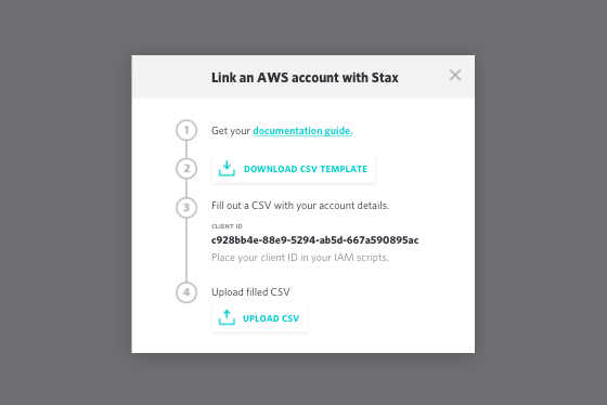
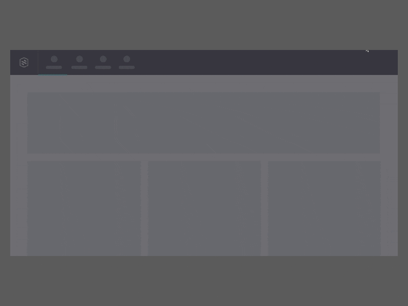
This was the instructions modal new customers got to connect their AWS account with Stax. After that prompt, they were on their own to complete the process.
To validate the assumptions we had around the issues that the current process entailed we conducted user interviews and we identified three main problems:
😔 Technical people (dev-ops and cloud engineers) complained about the process being too manual and time consuming – it required to go back and forth between different tools: Stax, Excel, a PDF guide and their AWS console.
😔 They were also making mistakes when filling the CSV they later had to upload to Stax, and the error messages and help documentation we offered were not very useful for them to understand how to fix them.
😔 Non-technical people (stakeholders, managers, finance folks) didn’t necessarily know about AWS or didn't have access to their teams' account details, so they couldn't understand how to proceed.
With these insights, we defined and prioritised the following design goals that helped us solve the problems we had identified:
🎯 Simplify the account linking process end to end by making it as much automated as possible, keeping the amount of tasks outside the app to the minimum.
🎯 Create clear error communications to help people understand what went wrong and how to fix it.
🎯Provide a clear path for people without AWS technical knowledge, so they could get the righ person to link the AWS account for them.
The hypothesis
We believed that by redesigning the process of linking an account to make it more automatic and easy to understand for everyone would increase the number of new customers successfully completing that step after signing up for the free trial - regardless of their technical knwoledge on AWS - as well as the number of customers upgrading after the free trial.
The solution(s)
The first thing we had to investigate were the technical constraints and challenges of linking an AWS account. We had several discussions with the engineers about how we could technically make the existing process smoother and remove friction from the flow. Our discussions centered around how to build a solution that would avoid users leaving the app while working around AWS technical constraints. These were highly technical conversations which I was not familiar with, so the engineers led this part and I mosly listened, scratched my head and asked a lot questions.
Automating the process
After several technical discussions with our devs, we found a technical solution that would simplify the process and reduce the number of times users had to interact outside the app to just one. Yay!
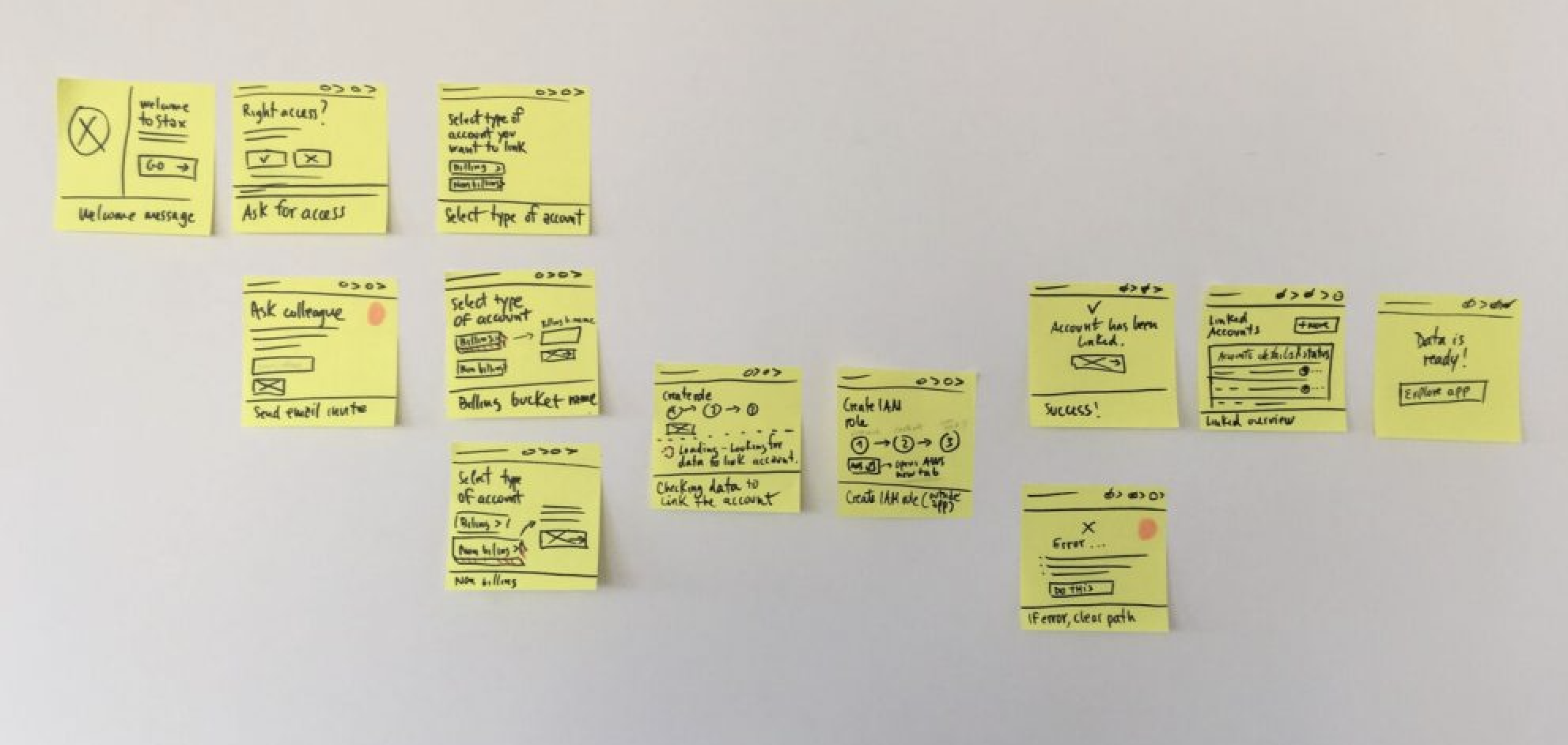
The new flow required only three simple tasks:
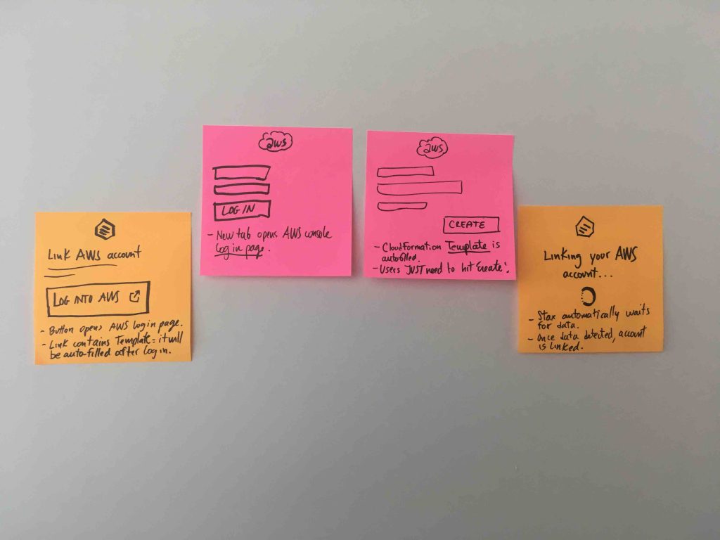
❶ Log into AWS console from Stax and give Stax read-only access to a specific AWS part of their account. This would allow us to pre-populate all the information that previously users had to manually type in a CSV file.
❷ Hit a button to confirm the details.
❸ Go back to Stax and wait for the account to be automatically linked.
The new flow key steps
A clear path for non-technical people
As I mentioned eariler, most of non-technical people didn't have access to their AWS details, unless they happened to also be cloud devs. To make it easier for these type of users to go through the process we designed a step in the flow asking them whether they had access to their company’s AWS console or not. In case they didn't or were not sure about it, they could simply send an email invite to a colleague with the right access and expertise who would receive a link to sign up and finish the linking process for them.
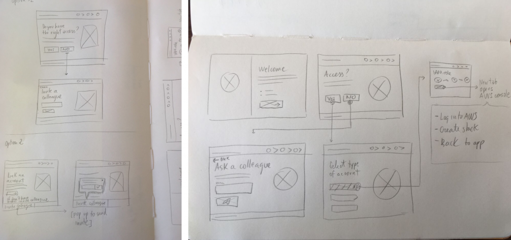
Sketches exploring solutions for non-technical users
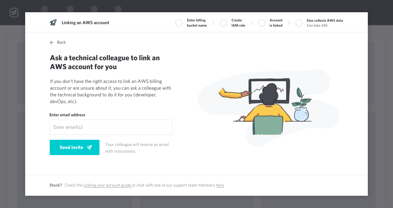
Final UI for inviting technical colleagues
Smarter error messages
To make sure that people were able to solve encountered errors while linking their AWS account to Stax, we mapped out all the possible things that could go wrong and prepared specific content and suggestions to solve each of them, as well as improved and updated our help documentation articles. To update this content we worked with the engineers and CS agent.
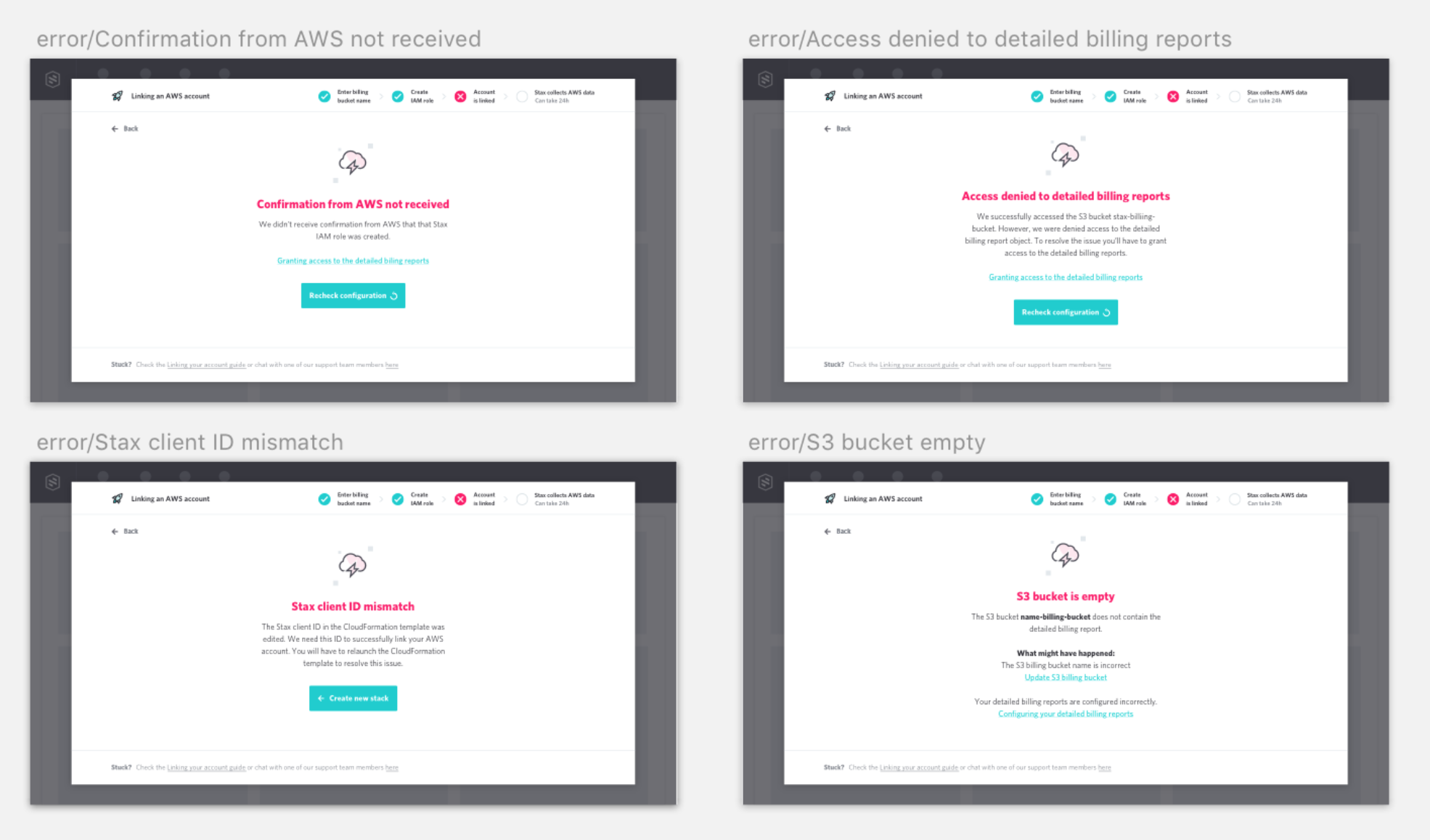
Some of the redesigned error messages
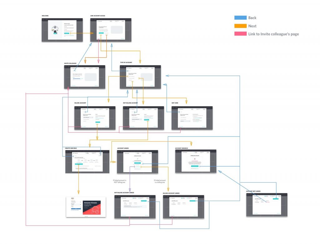
Putting the pieces together
The main goal was to remove the complexity from the current onboarding flow so I designed a flow that split up the task into a sequence of chunks. We wanted to avoid overwhelming the users and make it easy for them to follow. I used our modal component and added a progress indicator at the top so people would always know what was coming next.
Usability testing
We ran usability testing with some of our current clients and cloud devs to validate:
• If the steps to link an account were clear and easy to follow regardless the users' technical knowledge
• If the process felt quick and hassle free
• If people where able to link an AWS account without getting errors
• If people would understand how to fix an error if occurred
• If people without access to their AWS would know what to do

Testing the new flow
Relevant findings:
• Some people didn’t know why they needed to link a 'billing account'. (There are billing and non-billing accounts in AWS).
• People without access to their AWS account were unsure of what to do after inviting a technical colleague to connect an account for them.
• People would follow the path as they had the right access to link an account just to see what was next, even if they didn’t have access to their AWS console.
• After linking an account, people didn’t know what to do. The data can take up to 24 hours to populate, and while we said so in the UI, it wasn’t stated very prominently, so lots of tested users missed it.
Updating and fine tuning the design
I collected users feedback, analysed and identified required modifications to the designs. Some of the changes included modifying the flow to remove the option of linking non billing accounts, being more specific on how the 'invite a colleague' process worked and making the section where we explained that the data could take up to 24h to be ready more prominent.
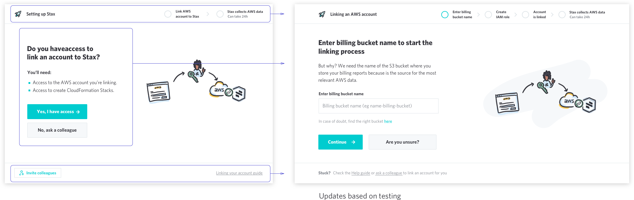
The design below shows one of these updates made to the designs.
Developement
Once the final prototype was updated, I sat as usual with the dev who was going to work on the project. Since I always try to involve them early on, they are already familiar with the flow and the designs, but it’s always important to spend some time reviewing the whole flow and chatting about final details and interaction before jumping into implementation phase. After the kick off with the devs, the last step for me was to break down the project in Trello tickets and assign whoever is responsible for each task.
Final prototype.
Measuring success
These are the main KPIs we looked for to measure success:
•Task success rate: increase the number of customers succesfully linking an AWS account after signing up – so people can start using the free plan, see the value of the product and potentially convert.
• Reduce task completion time: how much time it takes for new users to link an account vs previously – so we can detect if it’s as quick as expected.
•Increase amount of customers upgrading after the free trial.
• Reduce the amount of errors triggered when connecting the account.
• Increase the number of people who got an error but managed to link an account without contacting support – so we can understand if the documentation guide is useful / developers are able to help non-technical people trying to link an account.
• Number of support tickets related to the topic – so we can see if they have been reduced.
Results
Since we launched the redesign in February 2018, the user feedback has been positive. Users got in touch to say that they appreciated our hard work on “turning such a technically complex process into a beautiful and smooth experience”.
In a brief period of time we were able to reduce the number of errors users got when linking an AWS account and the number of people successfully linked has increased considerably. Our aim is to continue iterating and improving Stax onboarding process, focusing on the struggles of non-technical people and providing more value to new users earlier on in the process.